
Types:-
- Inline:-writing style directly for each element
- Style tag:- in the head tag ,use style tag
- External CSS:- create a seprate css file and link it.
Font-size units in CSS
Absolute
- px [1 inch = 96 px] not suitable for responsive websites
- pt
- pc
- cm
- mm
- in
Relative
- %
- em
- rem
- ch
- vh
- vw + many more
Pseudo Class
A Keyword added to a selector that specifies a special state of the selected element(s)
: hover
: active
: checked
: nth-of-type
check more types on mdn
Pseudo Elements
A Keyword added to a selector that lets you style a specific part of the selected element(s)
- ::first-letter
- ::first-line
- ::selection
CSS : Cascading StyleSheets
The CSS cascade algorithm's job is to select CSS declarations in order to determine the correct values
for CSS properties.
Selector Specificity

What to remember?
id > class > element
here is more

Inheritance in CSS
parents and bacchanote:- input and button me apply me nahi hoga, apply karne ke liye uske propery me value me "inherit" likhna parega.
input {background—color: inherit;}
Box Model


span (inline ka draback)
CSS Transitions
Transitions enable you to define the transition between two states of an element.

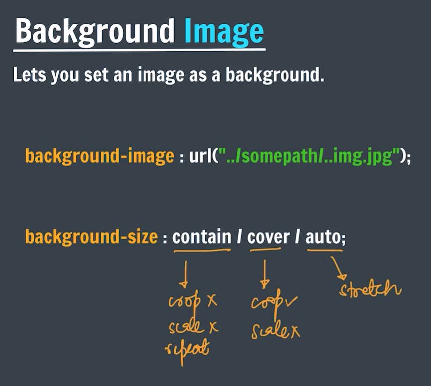
Background Image:-
Position
The position CSS property sets how an element is positioned in a document.
The top, right, bottom, and left properties determine the final location of positioned elements.
- Static- The top, right, bottom, left, and z-index properties have no effect.This is the default value.
- Relative:- the offset is relative to itself based on the values of top, right, bottom, and left.
- absolute:- The element is removed from the normal document flow, and no space is created for the element in the pagelayout.It is positioned relative to its closest positioned ancestor, if any; otherwise, it is placed relative to the initial containing block.
- fixed:- The element is removed from the normal document flow, and no space is created for the element in thepage layout.It is positioned relative to the initial containing block established by the viewport.
FlexBox:-

Justify Content
Tells how the browser distributes space between and around content items along the main-axis
• justify-content : flex-start;
• justify-content : flex-end;
• justify-content : center;
• justify-content : space-between; -ek dusre ke bich space bat do
• justify-content : space-around; - same but kuch space last vale ke bagal me bhi milega
• justify-content : space-evenly; - same but kuch space last vale ke bagal me bhi milega but equal as center spaces
Flex Wrap
Sets whether flex items are forced onto one line or can wrap onto multiple lines
• flex-wrap : nowrap;
• flex-wrap : wrap;
• flex-wrap : wrap-reverse;
Align Items
Distributes our items along the cross axis
• align-items : flex-start;
• align-items : flex-end;
• align-items : center;
• align-items : baseline;
Align Content
it sets the distribution of space between and around content items along a flexbox's cross-axis
• align-content : flex-start / flex-end / center
• align-content : space-between / space-around / evenly
• align-content : baseline;
Align Self
Aligns an item along the cross axis
(ye sirf single item ke liye kam karta hai)
• align-self : flex-start;
• align-self : flex-end;
• align-self : center;
• align-self : baseline;
1. Flex Sizing
• flex-basis
It sets the initial main size of a flex item.
flex-basis : 100px;
2. Flex Sizing
• flex-grow
It specifies how much of the flex container's remaining space should be assigned to the
flex item's main size
flex-grow : 1;
/*kisi element ko bada karna baki ki tulna me*/
Flex Sizing
• flex-shrink
It sets the flex shrink factor of a flex item.
flex-shrink : 1;
/*kisi element ko chota karna baki ki tulna me*/
Flex Shorthand
• flex-grow I flex-shrink I flex-basis
flex : 2 2 100px;
• flex-grow I flex-basis
flex : 2 100px;
• flex-grow (unitless)
flex : 2;
• flex-basis
flex : 100px;


0 Comments